|
DIgi-Quest - Your Quest For Knowledge
 Last year the sale of smartphones exceeded the sale of traditional phones; the sale of tablets exceeded those of desktop computers.
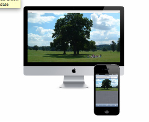
This trend has led to a need for eLearning developers to create courses that can be accessed from both mobile and desktop devices. The size of the screen that learners use to access eLearning lessons can vary widely. Consider the size of a typical mobile phone compared to the various shapes and sizes of tablets such as the iPad, Microsoft Surface, and Amazon Kindle Fire. You could develop several Projects that contain the same content, but are sized to work on specific devices; however, the problem is that you’d have to edit and update several projects! Who wants to do that? Additionally, who could possibly consider every screen size for every device? Even if you could build lessons for every screen size known today… What about the screen sizes for devices that have yet to be invented? As an alternative to managing multiple projects, you can now create a single, responsive project that provides optimal viewing, and an effective learning experience, across a wide range of devices and screen sizes. Responsive design is an approach to development that allows for flexible layouts and flexible images and assets. While the word responsive was traditionally used for building web pages, responsive design can be used to develop online courses that detect the learner’s screen size and orientation, and automatically change what the learner sees. If you'd like to learn more, contact us Info@digi-quest.com
4 Comments
Tim
10/9/2015 07:45:18 am
When do you think HTML5 will be fully functioning to enable all responsive projects to be just that? Thanks for posting I like having a resource that is up to dateMy team had Articulate and Captivate training
Bob
10/22/2015 07:29:04 am
Tim, 1/1/2016 05:55:22 pm
Very inspirational to hear about someone pursuing their dream and becoming successful instead of following the traditional path. 1/5/2016 11:41:08 pm
Get a responsive website design inside your budget from the best digital design agency in UK. Leave a Reply. |
Recent Posts/ Events
WELCOME Archives
January 2018
Categories |
 RSS Feed